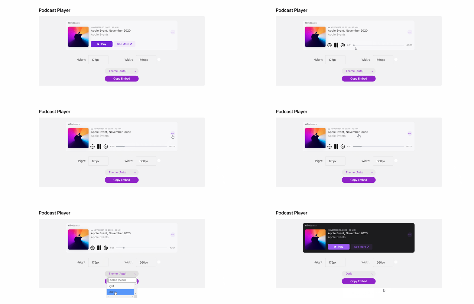
The Apple Podcasts embed player offers podcasters an Apple™ bespoke player to showcase and promote their podcast all over the interwebs.
The embed player is responsive so any podcast looks great on desktop and mobile devices. Search for a podcast on the Apple Podcasts Marketing Tools page, and scroll down to see the embed player.
My responsibilities were focused on the UI and interaction design execution of the embed player. I did not see through the engineering execution and design QA completely after design approvals.
The below players are in fact embedded on this page. Feel free to play around with them and resize your browser window to see them resize!
Viewing this page on desktop and not in incognito mode is recommended.
Episode Player Responsive Sizes
Large Episode Player
>425px width
Standard styling for desktops
Simplified playback controls: only Play/Pause, Skip Forward 30s, Skip Backward 15s. No collection features (such as add to My Library)
Tapping anywhere besides playback controls and the Details icon will deep-link to the episode in the Apple Podcasts app on your iPhone or Mac
2 line title metadata showing overflow & truncation
Small Episode Player
290-425px width
Standard styling for mobile
CTAs move under cover art to give more room for metadata, and allow adequate tap target size for overlapping CTAs
Date Format (Mon/Da/Year) and Time Format (59M99H) shortened styling to save space.
Show Player Responsive Sizes
Large Show Player
>425px width
Displays Show Description and Episode List
When playing an episode, left column view updates with Episode Description and shrinks Cover Art, Podcast Title, and Author
Standard styling for desktop
Small Show Player
290 - 425px width
Underwent multiple iterations and reviews to decide on what we should display in this small form factor, especially when considering the split view design when greater than 425 breakpoint
Standard styling for mobile


