cover.gif

Twitch Studio - Feature Launches

Lead Designer


At Twitch, I was the solo lead designer on Twitch Studio, a free streaming software designed for new streamers.

Twitch Studio was in open beta, and the team was busy pumping out features to meet our users’ needs and expectations.


My responsibilities on Twitch Studio included the full product design process :

  • Ideation and needfinding

  • Planning and conducting UXR sessions, and compiling insights into a report

  • Clear communication and collaboration with PM and engineering managers to set and understand MVP priorities

  • UX flow explorations and UI design iterations on biweekly sprint cadence leading to VP design approval

  • Pre-launch design QA and support with engineering and product

  • GTM support and asset creation for marketing

Twitch Studio KPIs have grew tremendously during my time on the team:

  • 1.1M to 7.8M total installs (+709%)

  • 3.7M to 44M total hours broadcast (+1189%)

  • 609k to 4.1M total unique streamers (+673%)

  • 253k to 467k MAUs (+184%)


Here’s an overview of some of the larger scoped features I’ve led and launched. I owned all of the following projects entirely from ideation to launch.

In-Game Overlay

Following a holistic study done by the Science team on new creators, we learned that it’s nearly impossible for a streamer with one monitor (70% of Twitch creators) to read and interact with their chat while gaming. This results in a streamer losing viewer engagement, which especially hurts while trying to capture a new viewer’s interest within seconds. While investing in a second monitor is the most common solution to this problem, this is especially cost-prohibitive to born streamers.

The In-Game Overlay allows a streamer to overlay their Activity Feed and Chat messages on top of a game so they don’t miss a moment with their community.

This feature is currently launched and live in-app. We’ve observed that the In-Game Overlay has led to statistically significant improvements in our KPIs, such as more successful streams (+39bps), born user retention (+25bps), and our main goal, chat engagement (+8.9%).


Onboarding and FTUE Redesign

New creators don’t want to spend time wrestling with codecs or hardware, but they do want to spend time tinkering with layouts, alerts, graphics, and sounds to make their stream look professional and personal. It’s important for new creators that their stream feels unique, and they look for software that blends ease-of-setup with creative freedom.

The original onboarding process in Studio was too linear and failed to educate new users on how to use the app. After doing User Research interviews and digging into the metrics, I iterated on multiple variations on the FTUE (first-time user experience), such as providing contextual coachmarks as shown above.

The team is currently running A/B and multivariate experiments on multiple UX flows to see which variant leads to the highest rate of successful completions and successful streams.


Alerts Redesign

Alerts, widgets, and activity feeds have become a vital part of nearly every creator’s workflow on Twitch. If you browse through the Twitch directory, it’d be difficult to find a stream that isn’t leveraging alerts and widgets to enrich the viewer experience and provide live feedback on important viewer interactions.

Unfortunately, alerts and widgets have historically been exclusively provided by 3Ps, many of which do not have aligned interests with Twitch creators or Twitch as a business. From UXR, we learned that users also simply want all their tools in one place without needing to find 3P solutions.

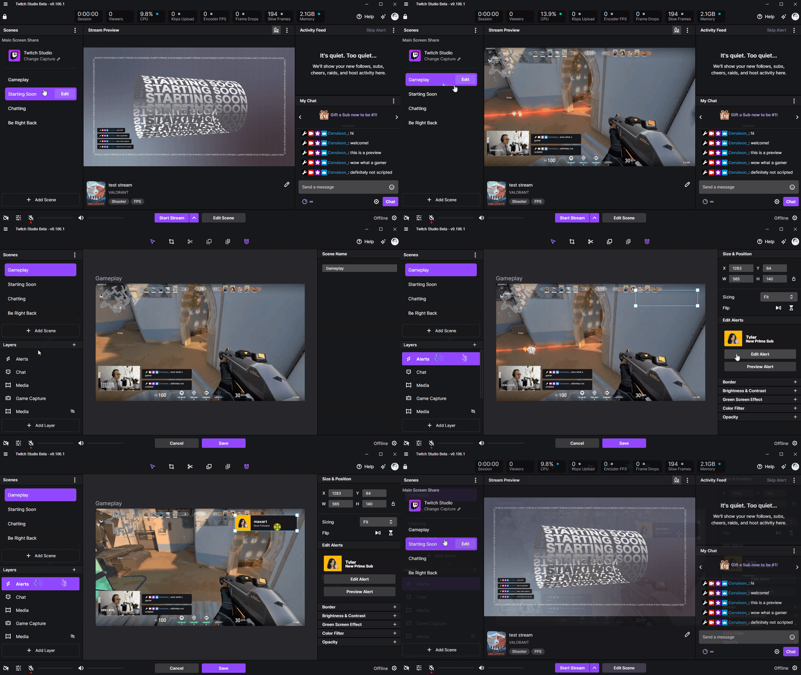
Studio previously had a minimal solution to Alerts. The redesigned Alerts experience incorporates features that were prioritized from feedback from UXR participants, forums, Discord, and from secondary research.

The redesigned Alerts experience is live and launched in-app. We are currently still tracking.


Transitions and Stinger Transitions

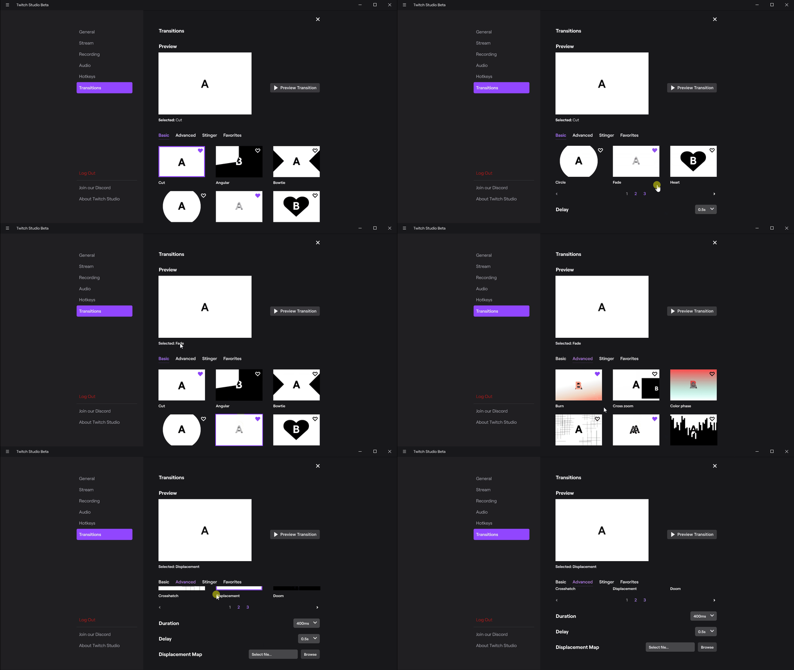
Transitions are essential to storytelling and upgrading a creator's production quality. From a basic fade to Stinger transitions (custom animated transitions that often cover the whole screen and cut to the next scene on a specific frame), transitions were one of the most requested features from users.

However, since it was difficult to assess the business value of working on transitions against existing KPIs (and to squeeze it into the existing roadmap), this project was completed as part of a hackathon.

Transitions are live and launched in-app.


Draw Mode (Telestrator)

A telestrator allows someone to draw over a live video feed to highlight specific aspects of that video feed. Common existing use cases are for sports commentary and weather forecasting. This feature wasn’t requested by users, and came from the team as part of a hackathon.

This project was well-received at the hackathon, and the team won 1st place in our category for “Inspire.” Because it was so well-received, I iterated on feedback and pushed the project over the finish line to make it production ready.

Draw Mode is live and launched-app.


To learn more about the design process, feel free to reach out to me on LinkedIn.